-
Welcome to the forums, Guest. Please note that you must make a post in the introduction thread and upload an avatar to gain full access to the forums.
You are using an out of date browser. It may not display this or other websites correctly.
You should upgrade or use an alternative browser.
You should upgrade or use an alternative browser.
Picture Feedback Megathread
- Thread starter Radical
- Start date
mikkel
Member
- Joined
- May 1, 2023
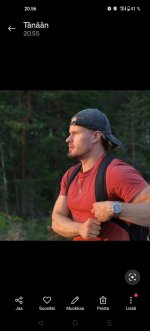
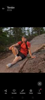
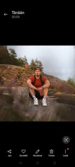
Any of these usable for tinder? A bit too posey in my opinion but what you guys think. Ugh, had to screenshot to make quality bad as possible so I could fit these here.
Attachments
TonyV
Member
- Joined
- Jul 29, 2024
- Name
- Tony
- Goal
- Get Laid
- Age
- 34
I like the 1st one the most, looks candid, like it was taken as you were gonna grab something in your backpack. Love the contrast between you (bright) and the background (dark), makes it easy to read. Also highlights your muscles without being a "hey look at me I'm puffed" kinda pic.Any of these usable for tinder? A bit too posey in my opinion but what you guys think. Ugh, had to screenshot to make quality bad as possible so I could fit these here.
- Joined
- Jan 19, 2021
ThelegendofJ
Member
- Joined
- Apr 11, 2024
I think it's perfect as a second shot, but well, you will see how it turns out!
But superdope shot!
ThelegendofJ
Member
- Joined
- Apr 11, 2024
I wouldn't use them, first two ones are too posed, last one feels to feminine to me.Any of these usable for tinder? A bit too posey in my opinion but what you guys think. Ugh, had to screenshot to make quality bad as possible so I could fit these here.
mikkel
Member
- Joined
- May 1, 2023
@ThelegendofJ @TonyV @Lord Rey
Thanks for the feedback! Different opinions, looks like I have to make the final decision by my own haha
Thanks for the feedback! Different opinions, looks like I have to make the final decision by my own haha
Lord Rey
Member
- Joined
- Jan 28, 2021
- Name
- Nicolas
- Goal
- Make serious money
- Age
- 31
@mikkel What would help to decide is to see your current profile. We can debate on the usability of new pics all the time we want, but what matters is to see if it's an upgrade or a downgrade relatively to your current pics in your profile. Maybe you already have a better hiking pic? And how does your first pic look like?
Last edited:
mikkel
Member
- Joined
- May 1, 2023
@mikkel What would help to decide is to see your current profile. We can debate on the usability of new pics all the time we want, but what matters is to see if it's an upgrade or a downgrade relatively to your current pics in your profile. Maybe you already have a better hiking pic? And how does your first pic look like?
This is my current profile (attachment)
Doesnt give me the results I want. So I'm still consistently looking for photo opportunities to update my photos.
Attachments
ThelegendofJ
Member
- Joined
- Apr 11, 2024
Your current profile is way better. If you look for upgrades, I would go for a city headshot, to make the background less dull. But still make sure your head is still the main focus. An example can be the shot I took from @Crisis_Overcomer
For the rest, just keep taking a shitton of pictures and improve them while you can, the quality is already there, some just look a bit too posed, so try to be doing things while you are taking pictures so it's less staged. (if I'm making sense?)
For the rest, just keep taking a shitton of pictures and improve them while you can, the quality is already there, some just look a bit too posed, so try to be doing things while you are taking pictures so it's less staged. (if I'm making sense?)
Attachments
TonyV
Member
- Joined
- Jul 29, 2024
- Name
- Tony
- Goal
- Get Laid
- Age
- 34
Honestly looks like a great profile. I'd drop #1 and replace it with #4 following @ThelegendofJ 's advice, those pics are redundant in effect, and in general outdoor pics are better than indoor. Pic #5 would be great zooming in on you, I have no idea about the red/blue stuff on the side but it disturbs the readability of the pic.This is my current profile (attachment)
Doesnt give me the results I want. So I'm still consistently looking for photo opportunities to update my photos.
Also, what results do you want? What's the size of the city you're based in, how many matches/likes do you get per week? If you got a problem with those pics I'd say your issue is somewhere else, not in the pics.
Paid Renegade
Member
- Joined
- Jun 18, 2022
Hey guys, looking for some quick feedback on whether this would be a good shirtless pic to use for tinder etc.

Would be replacing this pic, an older one I've been using for awhile-

Photofeeler comparison seems pretty clear but wanted to check here first, including if there's anything that could be done to further improve. Thanks! (BTW I have tried cropping in closer on the waterfall pic, it resulted in a lower score.)
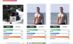
Actually I guess I could use both, I was thinking one shirtless pic would be sufficient but open to suggestions

Would be replacing this pic, an older one I've been using for awhile-

Photofeeler comparison seems pretty clear but wanted to check here first, including if there's anything that could be done to further improve. Thanks! (BTW I have tried cropping in closer on the waterfall pic, it resulted in a lower score.)

Actually I guess I could use both, I was thinking one shirtless pic would be sufficient but open to suggestions
- Joined
- May 21, 2022
- Goal
- Serve
- Age
- 30
@Paid Renegade, that's a great photo. Drop it into lightroom and lower the highlights some, and bump up the shadows for the face just a bit. I'd also saturate the blue hues just a little bit. Otherwise excellent shot.
Paid Renegade
Member
- Joined
- Jun 18, 2022
Good to know, thanks for the tips. When you say bump up the shadows, do you mean lighten those areas and then make the highlights darker? In the original photo the shadows were actually so harsh you couldn't see my face at all so I made my best guess trying to brighten it up.@Paid Renegade, that's a great photo. Drop it into lightroom and lower the highlights some, and bump up the shadows for the face just a bit. I'd also saturate the blue hues just a little bit. Otherwise excellent shot.
This was taken on a beach date btw. My number one hack I discovered for tinder photos this year is to find a couple girls with cameras who are into photography and invite them out to do fun things and take photoshoots. Definitely made grabbing good photos 100x easier and less awkward than taking pics of yourself in public. And it's free, and you kill two birds with one stone because they're also fun dates.
phoenix999
Member
- Joined
- Jun 19, 2024
- Name
- Devin
- Goal
- Get Laid. A lot (ENM)
- Age
- 37
- Motto
- Freedom is on the other side of fear
- Joined
- May 21, 2022
- Goal
- Serve
- Age
- 30
Yeah, I'm also being overly nitpicky. If the original photo is as you say, then this is probably a huge improvement.Good to know, thanks for the tips. When you say bump up the shadows, do you mean lighten those areas and then make the highlights darker? In the original photo the shadows were actually so harsh you couldn't see my face at all so I made my best guess trying to brighten it up.
M2H
Member
- Joined
- May 4, 2023
Honestly I just don't look good enough to date (in my opinion). I am currently using these pictures on dating apps and would love to hear any feedback on how I look, the picture themselves, etc.
I got a haircut a few months ago, and honestly it was probably not a good idea. Growing it back right now.
I got a haircut a few months ago, and honestly it was probably not a good idea. Growing it back right now.
Attachments
- Joined
- May 21, 2022
- Goal
- Serve
- Age
- 30
You look good enough to date BUT you need some major overhaul to your style and way better pictures.Honestly I just don't look good enough to date (in my opinion)
If you have not read KYIL's Tinder guide, please do. Review the fashion and photos section: https://killyourinnerloser.com/tinder-guide/
You're going to need some edgy upgrades because right now you look like you're in high school.
Vamos
Member
- Joined
- Jun 15, 2022
- Goal
- High quality gf
- Age
- 33
You have no deformity and are still very young, so you have a very solid base!Honestly I just don't look good enough to date (in my opinion). I am currently using these pictures on dating apps and would love to hear any feedback on how I look, the picture themselves, etc.
I got a haircut a few months ago, and honestly it was probably not a good idea. Growing it back right now.
The thing is, you still look like a child and not like a (young) man. but no problem, as is said solid base, you can work with that. Don't stress, you still have decades ahead of you. Go to the gym + martial arts, dress better, do something with your hair, grow a minoxidil stubble beard, become confident and you'll be at the top in 2-3 years.

